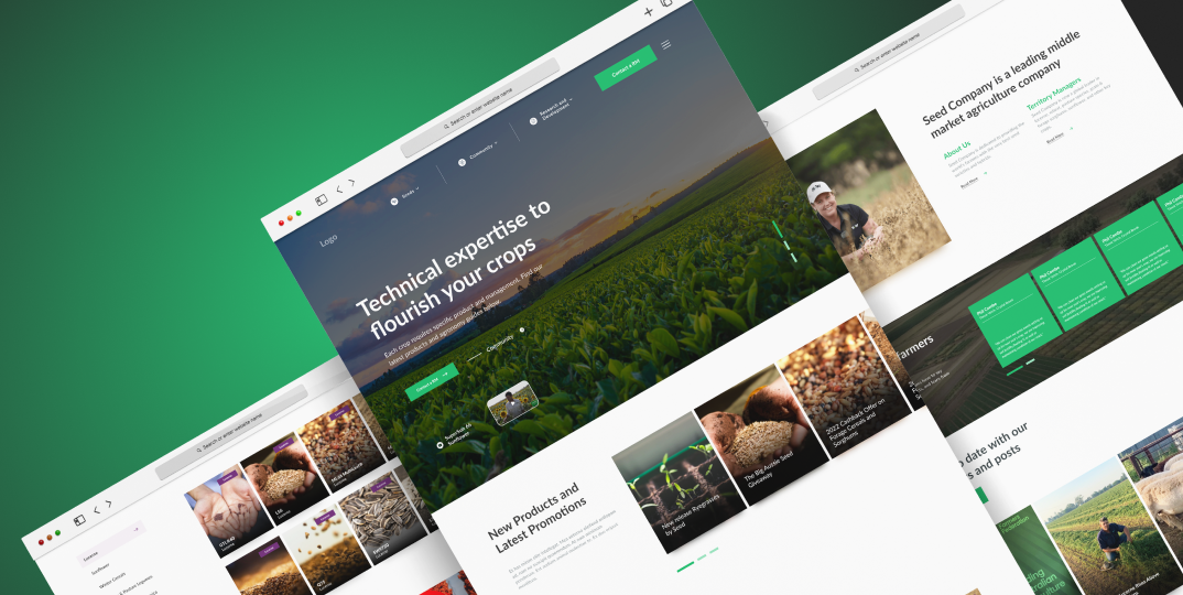
S&W Website Re-Development
UX UI Designer
3 Months
Miro, Figma
Adeladie, AU
Problem Statement
Redesign the current website to have a greater impact on the farming community.
Background
A little bit about the company:
- S&W Seed Company has been serving farmers world-wide for over 40 years.
- S&W has proven to support farmers across the globe, by creating leading products for cropping and forage systems.
- S&W has continually innovated to support farmers no matter the requirement.
- S&W strives to create a community for farmers, resellers, and agronomists alike to support global demands in farming while keeping the needs of farmers in the forefront of the supply chain.
Design Process
Design Thinking
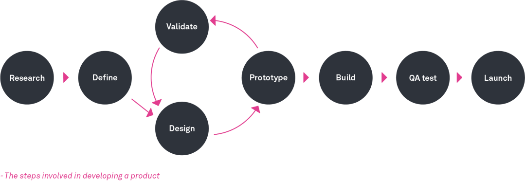
1. Research
Problems:
- Not enough budget to do proper user research.
- No time to do a proper user research.
Solution:
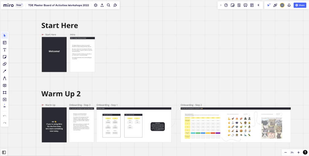
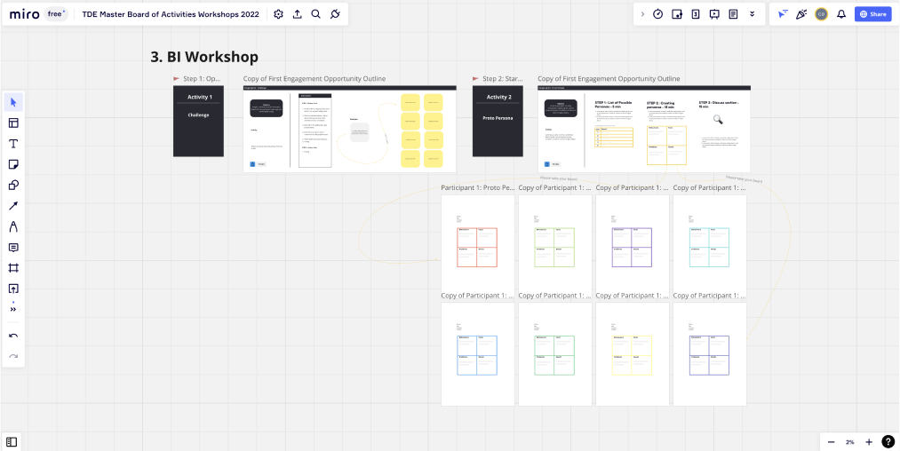
- Workshops: I have developed workshops for S&W stakeholders with the aim of knowing more in detail the principles and values of the company and also the users of S&W from the perspective of the stakeholder. The participants in these workshops were representatives of the marketing, sales, dev, and admin areas. In total there were 8 people in each workshop.
Results of the Workshops:
- We define the problems that the current site has.
- We define requirements that each of the S&W areas have.
- We identify the problems that the website has in terms of usability and that can be solved to obtain better leads.
- We identified the most consistent users of the website: Progressive and non progressive farmers plus small scale farmers, Agronomists and agricultural retail service persons, internal users like S&W Territory managers.
Solution:
2. Hotjar Platform: The data provided by the Hotjar platform was analyzed, which gave us a good overview of how users behave, heat maps and click per page, among other data.
Some relevant data we obtained:
30% of users
Are going directly to the "Seeds" page.
This gives us to understand that there is no relevant information about seed on the home page.
2 min of Average time
Approximately
This is an important figure since it gives us to understand that the user takes the time to read the information provided on the home page.
21% drop off rate
S&W’s home page is about the average for a current website. However, we must improve this percentage to have better conversions.
800 to 900 clicks
per page, approximately
420 of the clicks are on the main nav menu.
60.39% of users
go directly to the search for seeds and filters.
Note: With these data we were able to make decisions regarding the construction of the new website.
Competitor analysis
As part of this research, it was also possible to analyze the company’s main competitors. We were able to get very good insights into how these companies managed to solve problems.
2. Define
Main objectives of the website
We have defined objectives for the website:
- Grow the community of farmers in Australia.
- Correctly filter potential buyers (leads) by region.
- Organize and display in an organized way the information of the Seeds and their different categories.
- Facilitate the user to find the right seed through our regional managers.
Main Users
We have defined some main users who usually use the website:
- Non-Progressive Farmer
- Progressive Farmer
- Small-Scale Farmer
- Agronomist
- Reseller Customer Service
New Areas to add
With the data found in Hotjar we have defined some important areas that we should add to the website:
- More efficient Seed finder.
- More relevance to the seeds on the home page.
- Importance to events and news.
- Improve Blog and resources information.
3. Design
- Solution Architecture document: This document was created with help from the team. UX research, developer, project manager and I.
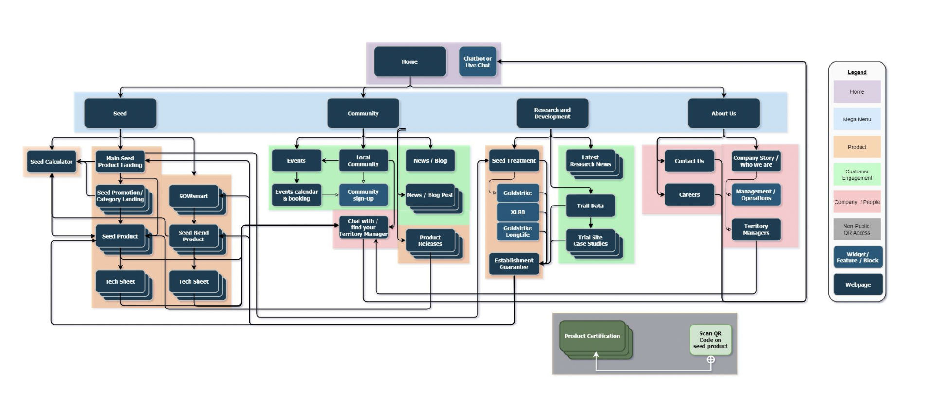
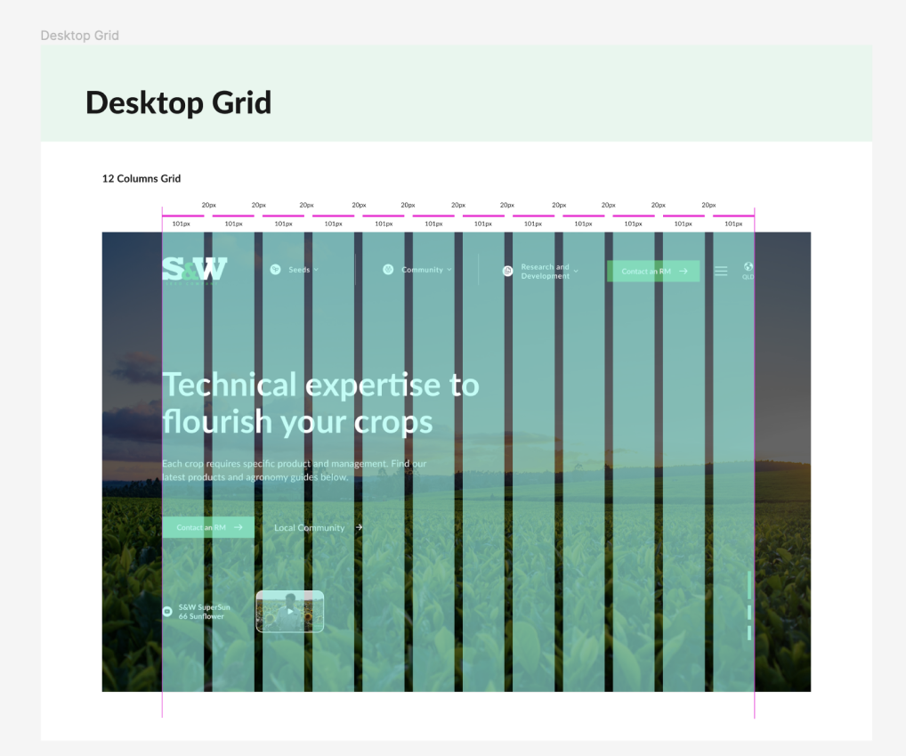
- Site map: We create the new site map for the entire website with the new features, including the features and possible areas of each page.
- Solution Architecture document: This document was created with help from the team. UX research, developer, project manager and I.
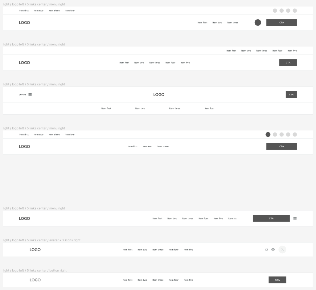
Wireframes
4. Validate
Winner
Why was this chosen?
Following a small internal testing conducted with members of the company, I arrived at the decision to choose this particular solution.
- There is an excessive amount of information on the page to have only one level in the menu.
- The client wanted just one status, something simple and easy to navigate.
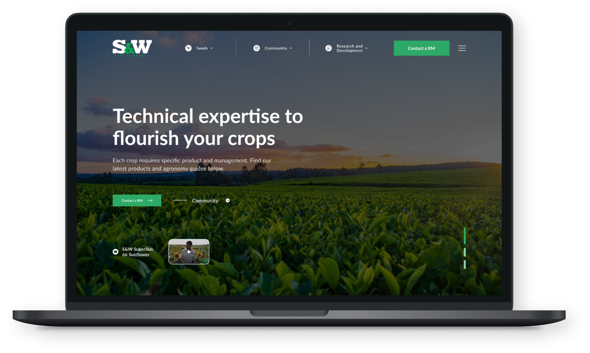
- They did not want many distractions for the user: for this reason, the pages that do not generate sales results such as (team, location, careers, etc) were hidden with a burger menu.
- Focus on products and CTA.
High Fidelity - Prototype
6. Conclusion
This project has allowed me to showcase my skills in building workshops and working with online tools such as MIRO. I was able to apply my knowledge in creating site maps, user journeys and the contruction of the Solution Architecture Document to create a comprehensive system design for the website. However, I acknowledge the need for improvement in future projects by implementing user testing, which was not possible due to budget constraints in this project. Nevertheless, I am proud of the work I have accomplished and look forward to continued growth and improvement in my abilities as a designer.
